How to read a suspension travel histogram
A suspension travel histogram plots position across the stroke on one axis and the share of the run spent there on the other. Read it by finding where the tallest part sits: a peak near dynamic sag means the spring is carrying the rider, and a spike against the end of the stroke means it is not.
Published
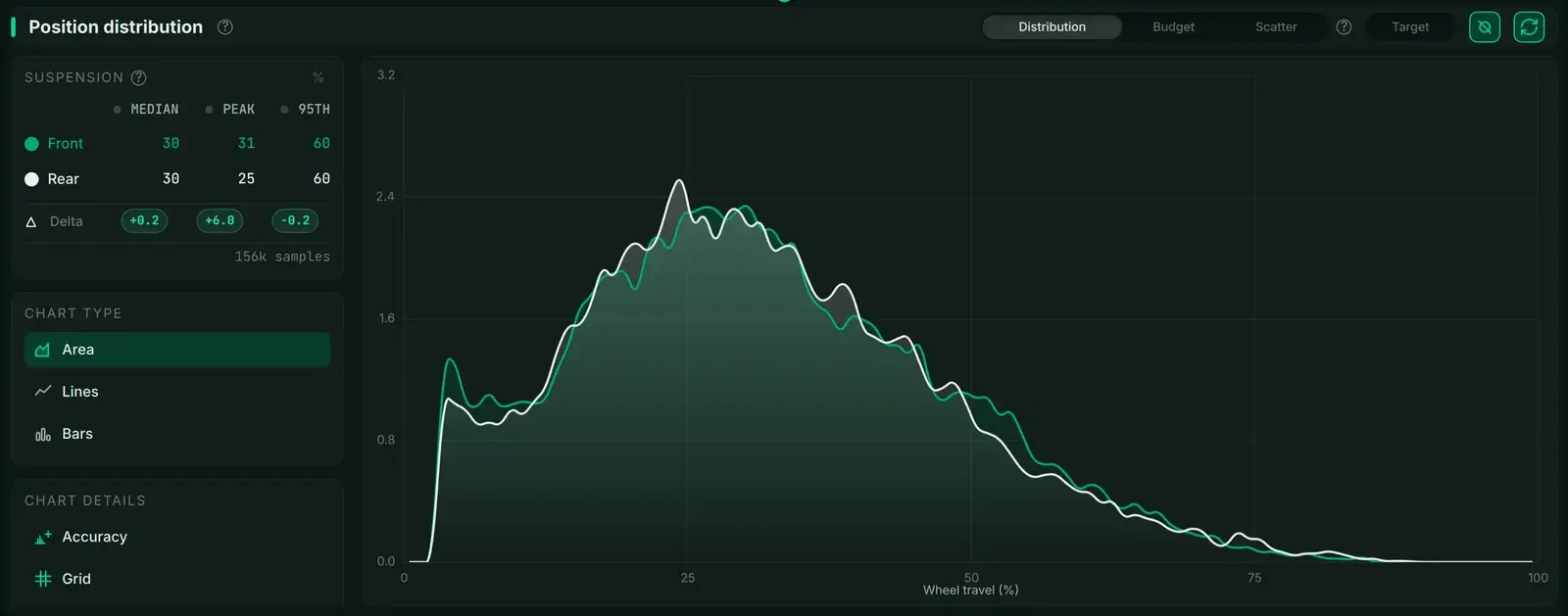
What a suspension travel histogram shows
- Travel histogram
- A chart of suspension position against time spent there: each column is one band of the stroke, and its height is the share of the run the suspension spent inside that band.
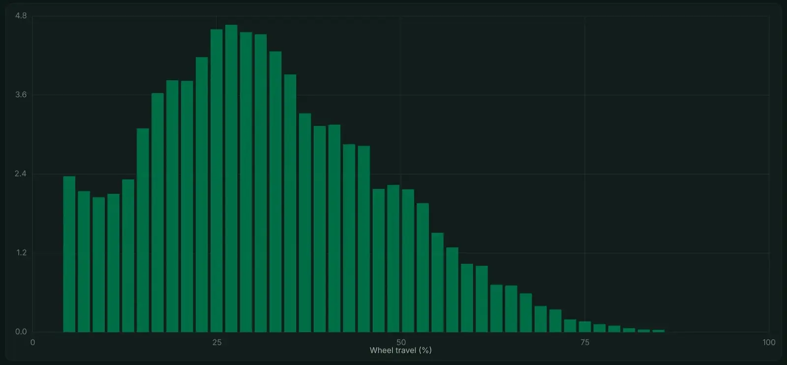
Tall columns are the positions the suspension used most, so the horizontal position of the peak is the first thing to read. Everything else — the width of the shoulder, the length of the tail, a spike at the far right — is read against it.
How the data behind the histogram is recorded
Linear sensors on the fork and shock measure shaft position, sampled at 500 Hz on Telemetry V3 and 1000 Hz on Telemetry V3 Pro. The software converts shaft movement to wheel travel using the frame's leverage ratio, which is why the axis reads in wheel travel rather than in shaft millimetres.
A histogram is therefore a summary and not the recording. It discards time entirely — two runs with identical histograms can feel completely different — which is what makes it good at answering where the suspension lived and useless at answering when. Data acquisition covers what else the same file holds.
What the shape of the histogram means
- A peak near dynamic sag, around 25% to 30% of travel: the spring rate is carrying the rider and the chassis is supported
- A peak past 50%: the setup is riding deep in the stroke, which points at a spring that is too soft
- A peak below 20%: the setup is riding high and is not using the travel available
- A spike hard against 100%: repeated bottom-outs, which a longer tail alone does not indicate
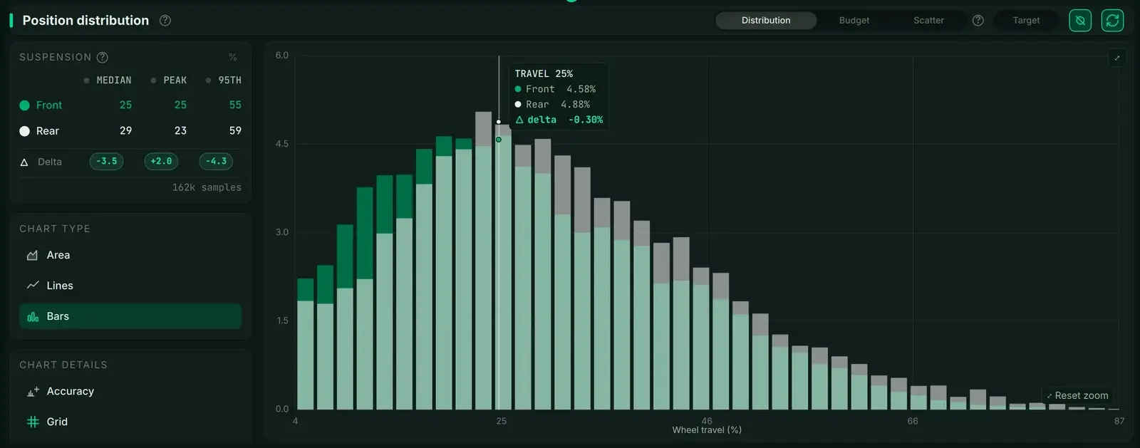
Reading front and rear together
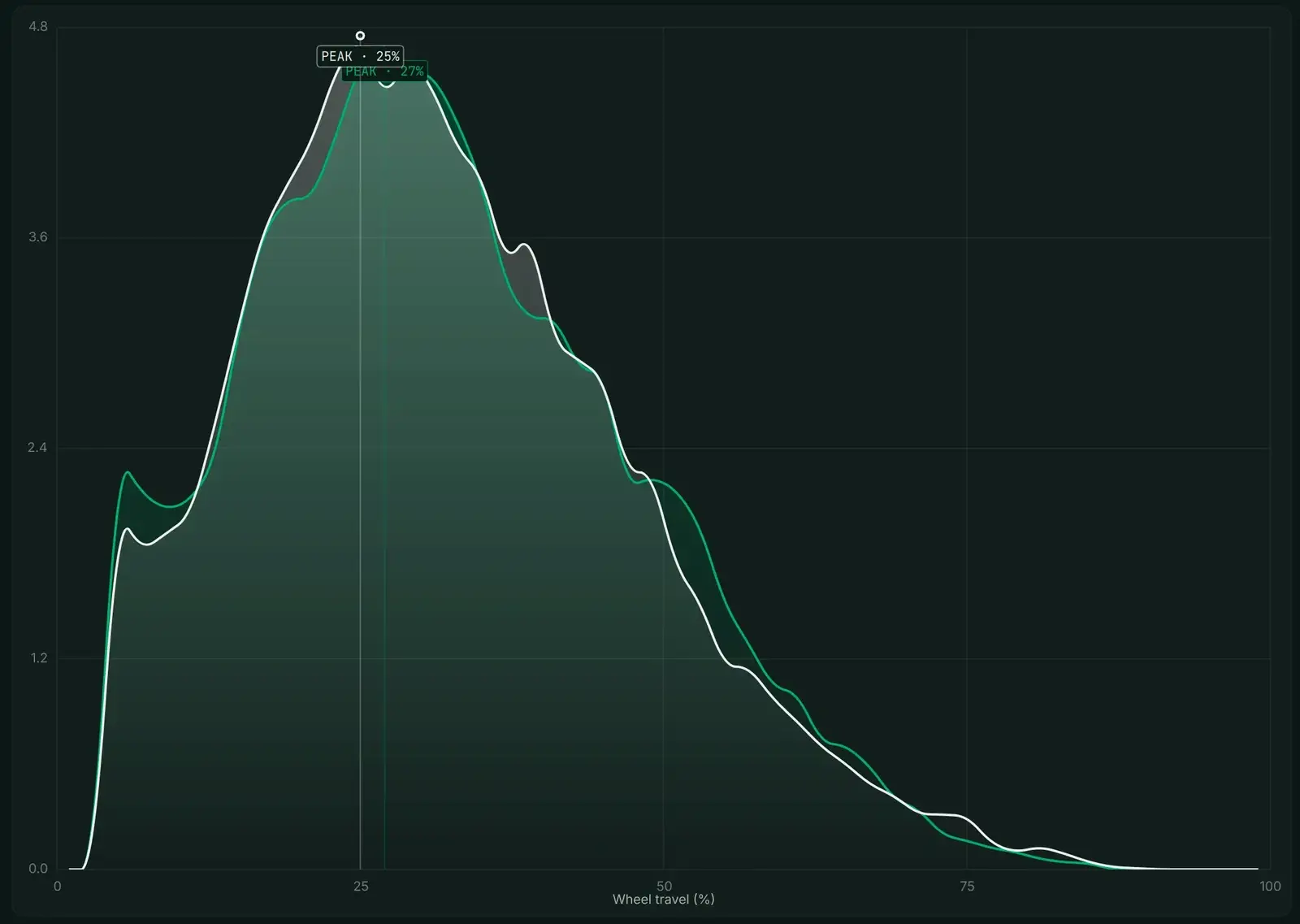
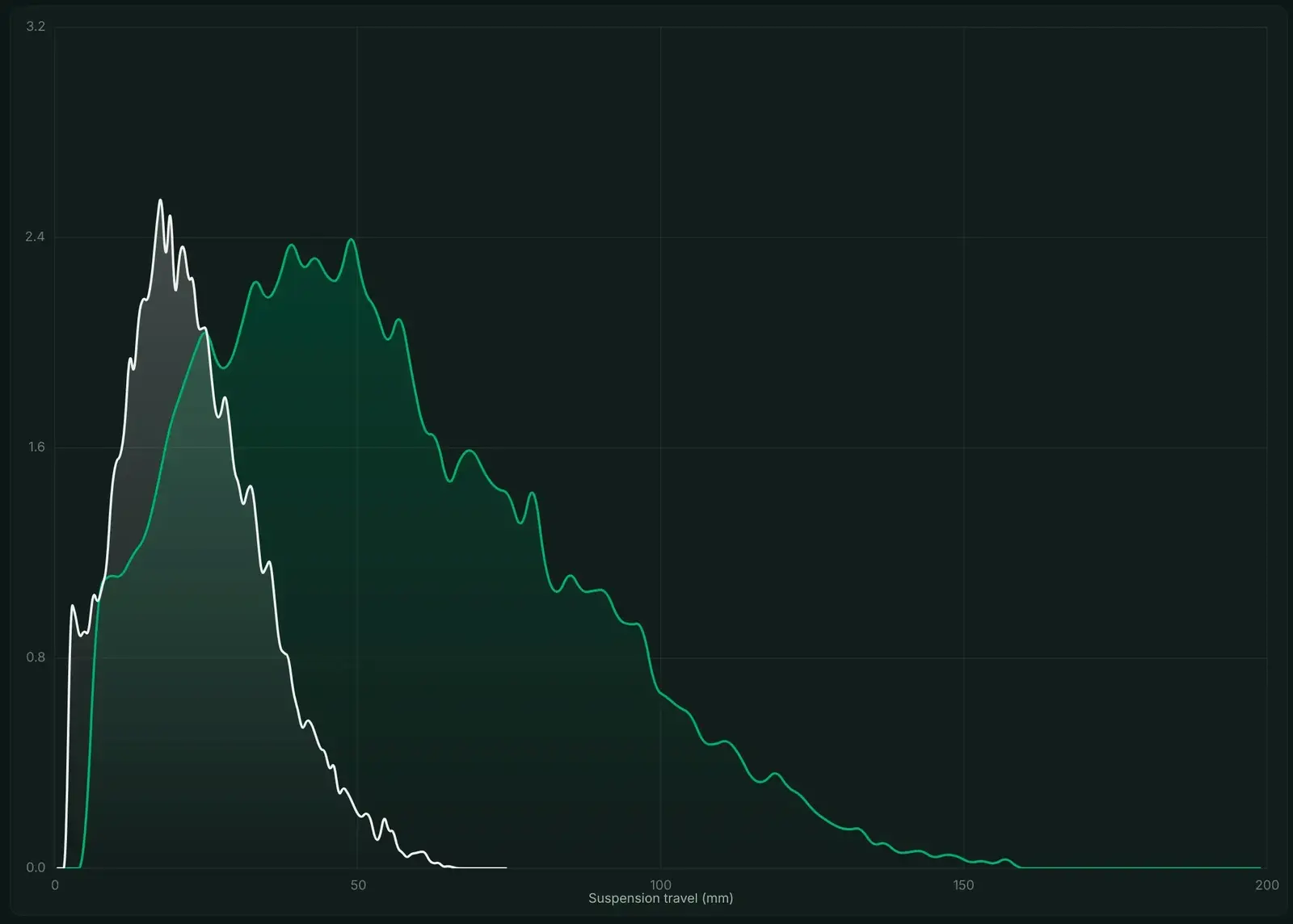
One end of the bike is only half the answer. Overlaying the front and rear distributions shows whether the two ends are sharing the work, and a mismatch is visible as a gap between the two peaks rather than as a fault in either one.
How many runs before a histogram means anything
A histogram is a count, so its shape is only as trustworthy as the number of samples behind it. The panel above reports 156,000 samples; a short section of trail at 1000 Hz gives a few thousand, and that is enough to show a shape but not enough to settle a setting.
Two runs that BYB Tech recorded make the point: 8,212 samples over 8.2 seconds of Livigno, and 11,020 samples over 11.0 seconds of a supercross track. Both draw a clean distribution. Neither is a diagnosis, because eleven seconds of one rider on one section is not the ride.
The method that does work is a controlled comparison. Ride the same section at the same effort, change one thing, ride it again, and compare the two histograms against each other rather than against an ideal shape.
Common questions
- What does a good travel histogram look like?
- A single peak near dynamic sag, roughly 25% to 30% of travel, with a wide shoulder and a tail that thins out toward the end of the stroke. What it should not have is a second peak, or a spike against 100%.
- What causes twin peaks in a travel histogram?
- Two peaks usually mean the run contained two different kinds of riding — a smooth section and a rough one, or a climb and a descent — rather than one setup fault. Splitting the run by section before reading it is the fix.
- How many runs do you need before the data is reliable?
- Enough samples that the shape stops changing when you add more. One short section at 1000 Hz gives a few thousand samples and a shape that moves run to run; a full session gives six figures and a shape that holds.